By: David Mykel
There is a very small word that sometimes creates a big problem in today’s litigation graphics: Rag. “Rag” is the term for the uneven edge of text in a paragraph when it is unjustified, i.e., aligned on only the left or right margin, like the way the text on this web page is aligned on the left. The difference is that web design doesn’t give many options for adjusting text rag. There are four basic variations of text alignment to choose from in typography: left-aligned, right-aligned, justified, and centered. When creating litigation graphics, one should always use a left aligned rag. Many of our clients ask us why, and the simple answer is that English is read from left to right – so left justified text is inherently easier to read. If you want confirmation of this, ask yourself the last time you read a novel that had centered or right-aligned text.

Figure 1: Example of a good rag.
The rag is probably one of the most overlooked details in litigation graphics, yet its flow can make or break the look and feel of your presentation. A common mistake is that most presenters rely on whatever rag Microsoft Office decides to give them, which leads to incomplete thoughts, awkward spacing, and a frustrated audience. Our goal when writing descriptive text for our presentations should always be to convey our message in the most clear and persuasive way possible. An effective way to accomplish this is by using proper rags. What is the difference between good rag and bad rag? A good rag maintains a word flow that places importance on giving paragraphs pleasing shapes and where the line breaks go in and out in modest increments, while keeping important phrases intact. Each line holds its own weight and structure, standing on its own to make a point. Not that each line has to make a complete point, but if the reader is to only read that line, the words will all share the same context. Massaging a rag for the most pleasing presentation possible also entails such mundane considerations as keeping technical phrases, dates, full names and bolded or emphasized text intact for the best possible comprehension. No computer program can do these things effectively; it requires training, patience and a practiced eye.
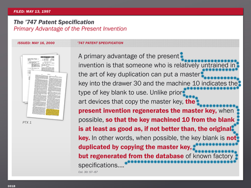
Figure 2: Example of a bad rag. Distracting shapes can detract from your message.
A bad rag creates distracting shapes of irregular white space in the margins and/or column where line breaks are varied and inconsistent. The sentence lines frequently break the author’s thoughts and points, requiring the audience to frequently scan up and down between the lines to follow the message.
At VisuaLex, one element that clients have become accustomed to expecting is our painstaking attention to detail. Not only do we “make the complex clear,” but we also make it simple, by paying attention to things that our audience may not pick up on, but will certainly appreciate. In our Precision Points newsletter, we bring to light some of these important differences that separate us from our competition, and identify those things that you want and need in your presentation, but didn’t think about. This is the VisuaLex difference, and it is why some of the most prominent litigators continue to partner with us.
You can also view the article here: http://www.visualexllc.com/PrecisionPointsJul13/PrecisionPoints.html
